A savings app for first-jobbers that felt like a bank statement.
All work
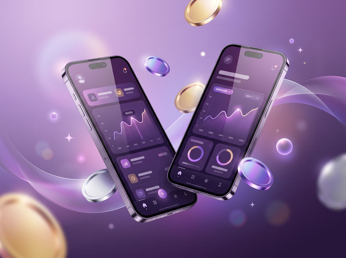
BrandingApp UIConcept project
Moolah
Friendly money, minus the finance-bro energy.
The story.
Navy blue, a shield icon and stock photos of people pointing at laptops.
Money as a mood: bright greens, chunky illustrations and nudges that read like texts from a friend.
The numbers.
+XX%Headline result, e.g. sales or sign-ups
XX×Return on ad spend or growth multiple
XXkReach, followers or downloads
XXAnything else worth bragging about
What we made.
Identity systemImage or video goes here
Onboarding illustrationsImage or video goes here
Launch adsImage or video goes here
How we got there.
- 01
Sniff
A diary study with first-jobbers and their spending guilt.
- 02
Scheme
A voice and tone guide: supportive, never preachy.
- 03
Make
Brand identity, app UI kit and onboarding flows.
“Client quote goes here. One or two lines about what changed for them, in their words.”
Delivered
Brand identityApp UI designIllustration systemLaunch campaign